
Minimalist vs. Bold: Which Site Sign Style Works Best?
When it comes to site signage, the design choice you make can have a big impact on visibility, branding, and overall effectiveness. Some businesses prefer a sleek, understated look, while others go for loud colors and bold typography that can’t be ignored. Both approaches have their advantages, but choosing the right one for your project depends on your goals, audience, and environment.
Understanding Minimalist Site Signs
Minimalist site signs are all about simplicity. They typically use clean lines, neutral colors, and straightforward typography. The focus is on clarity and elegance rather than visual overload. This style works well in professional environments where the audience appreciates subtlety, such as corporate office complexes, modern developments, or upscale retail spaces.
In busy urban settings like Vancouver, minimalist site signs Vancouver can stand out not because they shout for attention, but because they offer a refreshing, easy-to-read presence amid visual clutter. They also often age better visually, as trends change, keeping your brand looking timeless.
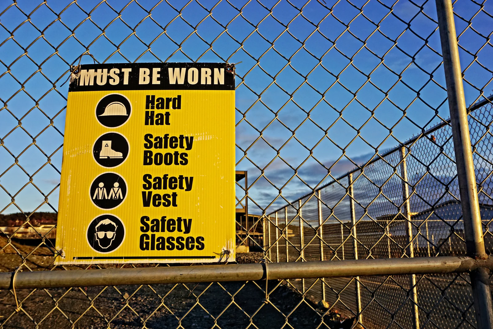
The Appeal of Bold Signage
On the other end of the spectrum, bold signage is designed to grab attention instantly. It uses strong colors, dramatic typography, and eye-catching graphics. For high-traffic areas or environments where visibility from a distance is critical, bold signs can be far more effective.
This is especially true for construction signs Vancouver, where safety information, hazard warnings, and directional cues must be noticed quickly. Bright colors like yellow, orange, or red paired with large fonts ensure that passersby and workers see important messages even from a distance. Companies such as Amber Sign & Design specialize in creating both high-visibility bold signs and sleek minimalist designs to suit different business needs.
When to Choose Minimalist vs. Bold
The choice between minimalist and bold signage should be driven by purpose and context:
- Minimalist is best for brand-focused signs where elegance and professionalism matter more than immediate impact. These are great for wayfinding signs, building nameplates, or real estate developments aiming for a premium feel.
- Bold is ideal when immediate attention is crucial, such as safety warnings, promotions, or temporary event signage. It’s also more suited for environments with heavy foot or vehicle traffic.
In some cases, blending the two can be effective, for example, using a minimalist design for the overall structure but incorporating bold colors for key messages.
Branding and Audience Considerations
A sign is often the first impression someone has of your business. Minimalist designs send a message of sophistication, stability, and attention to detail, while bold designs project energy, urgency, and accessibility. Think about who your audience is. A luxury brand might alienate its target market with overly bright, bold signage, while a construction company might fail to grab attention with a subdued palette.
Environmental and Practical Factors
Another consideration is the surrounding environment. In a crowded visual space filled with advertising, bold signage might be necessary to break through. In a scenic or architecturally refined location, minimalist signs might be more in harmony with the surroundings.
Durability and maintenance also matter. Minimalist designs often involve fewer colors and simpler graphics, which can reduce fading and wear over time. Bold signs, however, are usually made to withstand the elements and remain vibrant for as long as possible.
Partnering with the Right Signage Provider
No matter which style you choose, working with an experienced signage company Vancouver ensures your sign is designed and built for both style and function. A professional team can help you assess your needs, choose the right materials, and create a design that communicates your message effectively while withstanding Vancouver’s weather conditions.
Minimalist and bold sign styles both have their place in business and construction settings. Minimalist designs excel at creating a timeless, professional image, while bold designs demand attention and deliver information quickly. The key is to match your signage style to your brand personality, audience expectations, and environmental context.
Whether you need understated elegance or eye-catching impact, the right signage can make all the difference in how your message is received. For expertly crafted solutions that balance style, durability, and visibility, Contact Amber Sign & Design – Vancouver Sign Company is ready to help you design, build, and install signage that truly represents your business.