

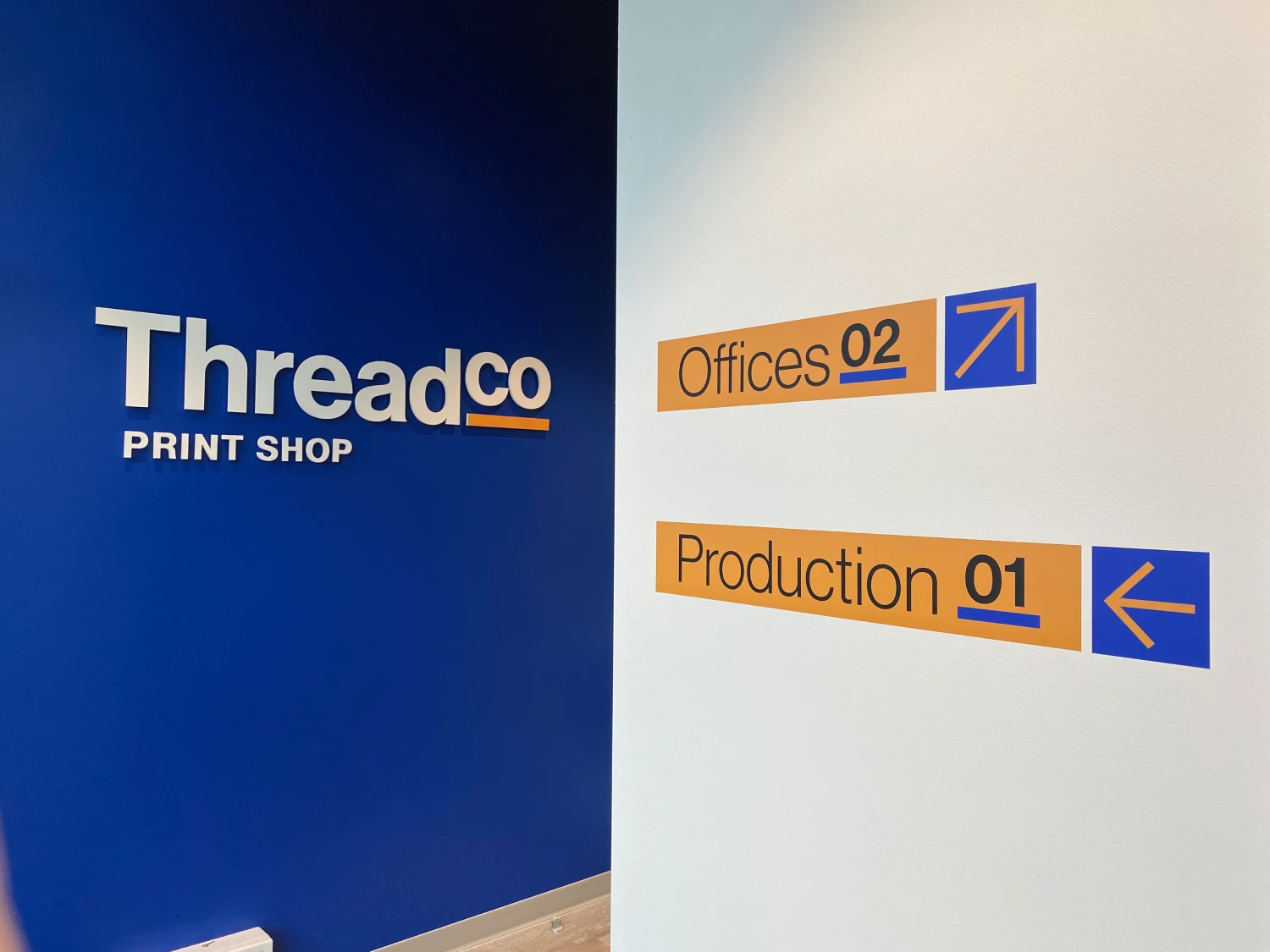
Why Do Visitors Get Lost in Vancouver Buildings Even When Signs Are Installed?
A building can have signs at its entrance, along its hallways, and outside its elevators, yet visitors may still struggle to find the right office, meeting room or service desk. The problem is not always a lack of signage. Often, the signs do not appear where people need them, provide unclear directions or fail to explain what to do next.
For commercial buildings in Vancouver, this can affect more than convenience. Visitors who arrive late for appointments, delivery drivers who enter the wrong area and customers who cannot locate a business may all experience unnecessary frustration.
Effective wayfinding depends on how people move through a space, interpret information and make decisions at important points along their journey. Understanding these factors helps property managers and business owners create a more organised visitor experience.
The Short Answer: Why Do Visitors Miss Signs in Commercial Buildings?
Visitors can get lost even when signs are installed because the signage system may not match the building’s layout or the way people actually navigate it. Signs might be positioned too late, use unfamiliar terminology, contain too much information or fail to direct visitors to the next decision point.
Common problems include:
- No clear directions immediately after the main entrance.
- Inconsistent names for the same department, floor or destination.
- Missing signs at corridor intersections and elevator exits.
- Poor contrast, small lettering or confusing arrows.
- Directories that list destinations without explaining how to reach them.
- Temporary construction changes that make existing directions inaccurate.
The solution is to assess the complete visitor journey instead of simply adding more signs to the building.
1. Visitors Need Directions Before They Reach a Decision Point
One of the most common wayfinding mistakes is placing a directional sign after visitors have already reached a confusing intersection.
Imagine someone entering a Vancouver office tower for a scheduled meeting. The lobby directory lists several companies, but the visitor does not know which elevator bank to use. By the time another sign appears, the visitor may already have taken the wrong route.
Good signage anticipates where people will need to make a decision.
For example, a building may need clear directions at the main entrance, near the reception desk, beside elevator banks and at corridor intersections. Each sign should provide enough information for visitors to continue confidently without having to retrace their steps.
When planningWayfinding Signs Vancouver businesses and property managers, the objective should be to place information at the moments when people need it, not simply wherever there is an available wall.
2. Too Much Information Makes Signs Harder to Understand
A sign can contain every necessary detail and still fail if visitors cannot quickly identify the information relevant to them.
Long department lists, multiple arrows, inconsistent abbreviations and tightly packed text can make a directory difficult to scan. Visitors may stop to read it, overlook the correct destination or ask reception for directions anyway.
A more effective approach is to organise information into clear levels.
For instance, a medical building might guide visitors through a sequence such as:
- Main entrance and reception.
- Floor or department identification.
- Directional signs at corridor intersections.
- Room numbers and destination labels.
Each sign should communicate the information required for that particular stage of the journey. A lobby directory can provide a broader overview, while corridor signs should focus on the next destination or turn.
This approach is particularly useful in office towers, healthcare facilities, educational buildings and large commercial properties where visitors may be unfamiliar with the layout.
3. Inconsistent Sign Names Create Unnecessary Confusion
Visitors may struggle when different signs use different names for the same place.
For example, a lobby directory might list “Client Services,” while a corridor sign says “Customer Support” and the office door displays “Service Department.” Employees may understand that these refer to the same location, but first-time visitors may not.
The same problem occurs when floor numbers, department names, room identifiers or building entrances are labelled inconsistently.
A coordinated signage system should use the same terminology across directories, directional signs, room signs and digital building information.
Before installing new signs, property managers should review the names used throughout the building. Standardising these labels can improve navigation without requiring a complete signage replacement.
4. Poor Sign Placement Can Make Useful Information Invisible
Even clearly written signs can fail when people cannot see them from the right position.
Signs may be hidden behind open doors, blocked by furniture, placed too high or positioned where visitors naturally look in another direction. Reflections, poor lighting and crowded entrance areas can also reduce visibility.
Consider a commercial lobby with a directory positioned beside a side wall, while most visitors enter facing the reception counter. The directory may be easy to read once discovered, but its location does little to help visitors immediately understand where to go.
A practical signage assessment should examine:
- The direction from which visitors approach each sign.
- Whether the sign is visible before a turn or decision point.
- Viewing distance and readable text size.
- Lighting, reflections and possible obstructions.
- Whether the sign remains visible during busy periods.
Testing the route by walking through it as a first-time visitor can reveal placement problems that may not be obvious to someone familiar with the building.
5. Visitors Cannot Always Interpret Arrows and Symbols
Arrows appear simple, but their meaning depends on their position, orientation, and relationship to the destination.
A poorly placed arrow may appear to point towards a nearby doorway instead of a hallway. A symbol may be unfamiliar to international visitors, while abbreviations may make sense only to regular building users.
Effective directional signage should use straightforward wording, consistent arrows and familiar symbols where appropriate.
For example, a sign directing visitors to reception should identify the destination clearly and pair it with an arrow that unambiguously indicates the route. The same visual logic should continue throughout the building.
Where a facility serves people with different language abilities or accessibility needs, understandable wording, readable typography and appropriate visual cues become especially important.
6. Elevator Areas and Floor Changes Need Special Attention
Elevators create a common navigation challenge because visitors must make another decision as soon as they reach a different floor.
A directory in the ground-floor lobby may identify the correct destination, but visitors can still become confused after exiting the elevator. They may not know which corridor to follow, whether they need to turn left or right, or which suite contains the business they are visiting.
A well-planned system connects each stage of the journey.
For a multi-storey Vancouver commercial building, this may include floor directories, elevator identification, corridor direction signs and individual room or suite numbers. These signs should use consistent labels so that visitors can follow the same destination name from the entrance to the final door.
The goal is to remove uncertainty at every transition, particularly where several corridors or departments look similar.
7. Temporary Changes Can Make Existing Signs Misleading
Commercial buildings rarely remain completely unchanged. Renovations, tenant turnover, relocated reception desks, closed corridors and temporary entrances can make established directions inaccurate.
When temporary signs conflict with permanent signage, visitors may receive two different instructions. A printed directory might direct someone to an entrance that is closed for construction, while a temporary notice provides an alternative without explaining the complete route.
Property managers should review signage whenever a building layout or destination changes.
Useful measures include:
- Updating directories when tenants move or change suite numbers.
- Installing clear temporary directions during construction.
- Removing outdated notices as soon as they are no longer needed.
- Checking that temporary signs match the building’s established terminology.
- Reviewing permanent signs after renovations are completed.
A simple maintenance process helps prevent small changes from becoming recurring navigation problems.
8. How Can Better Wayfinding Signs Vancouver Buildings Use Improve Visitor Flow?
Effective wayfinding is a connected system, not a collection of unrelated signs.
The most usefulwayfinding signs property owners invest in are designed around the building’s layout, visitor needs and destinations. Rather than treating each sign as a separate item, the planning process should establish how every sign supports the next step.
A practical improvement plan can follow four stages.
Stage 1: Map the visitor journey. Identify the main entrances, reception points, elevators, intersections, and final destinations.
Stage 2: Identify confusion points. Review where visitors stop, turn back, ask for help or enter the wrong area.
Stage 3: Match signs to decisions. Use directories, directional signs, floor identification and room labels where they are most useful.
Stage 4: Test and maintain the system. Walk through the building as an unfamiliar visitor would, correct unclear directions and review signs whenever the layout changes.
This process helps businesses address the reasons people get lost rather than simply increasing the number of signs.
9. When Should a Building Upgrade Its Wayfinding System?
A signage review may be worthwhile when reception staff repeatedly give directions, visitors arrive late because they cannot find a destination, tenants report navigation complaints or recent renovations have changed traffic routes.
It is also useful when a building has grown more complex through additional tenants, new departments or multiple entrances.
The review should consider whether the current signs are readable, consistent, correctly positioned and sufficient to guide someone from the building entrance to the intended destination.
Replacing every sign may not be necessary. Sometimes the most effective improvements involve relocating a directory, adding a directional sign at a critical intersection or standardising room labels across a floor.
The right approach depends on the building’s layout and the specific problems visitors experience.
Choose a Sign Company Vancouver Businesses Can Work With
A successful wayfinding system starts with understanding how people use a building. Clear wording, logical sign placement, consistent destination names and coordinated directional information can make a significant difference to the visitor experience.
Amber Sign & Design provides custom wayfinding and directional signage solutions for commercial properties, offices and other environments in Vancouver. Its services include customised signage designed to support navigation while maintaining a consistent professional appearance.
As asign company Vancouver businesses can approach for tailored signage, Amber Sign & Design can help property managers and business owners explore solutions suited to their building layout, branding and navigation requirements.
If visitors regularly struggle to find their destinations, contact Amber Sign & Design to discuss your wayfinding signage project and identify opportunities to make your building easier to navigate.
Frequently Asked Questions
Why do visitors get lost in buildings even when directional signs are installed?
Visitors may get lost when signs are poorly positioned, difficult to read, inconsistent or missing at important decision points. Effective wayfinding connects the entrance, directories, corridors, elevators and final destinations into one clear route.
What types of wayfinding signs are useful in Vancouver commercial buildings?
Common options include lobby directories, directional signs, floor identification signs, elevator signs, corridor signs, room numbers and suite identification. The right combination depends on the building’s size, layout and visitor needs.
How can businesses make office navigation easier for first-time visitors?
Businesses can use consistent destination names, readable text, clear arrows and signs positioned before visitors need to choose a route. Testing the journey from the main entrance to common destinations can reveal missing or confusing directions.
How often should commercial building signage be reviewed?
Building managers should review signage whenever tenants move, departments change, renovations affect access or visitor complaints reveal recurring problems. Routine inspections can also identify damaged, obstructed or outdated signs.
Where can Vancouver businesses get custom wayfinding signs?
Amber Sign & Design offers custom wayfinding and directional signage for commercial environments. Businesses can discuss their building layout, signage requirements and design preferences to explore a suitable navigation system.
